︎︎︎︎︎︎︎︎︎
OKE POKE
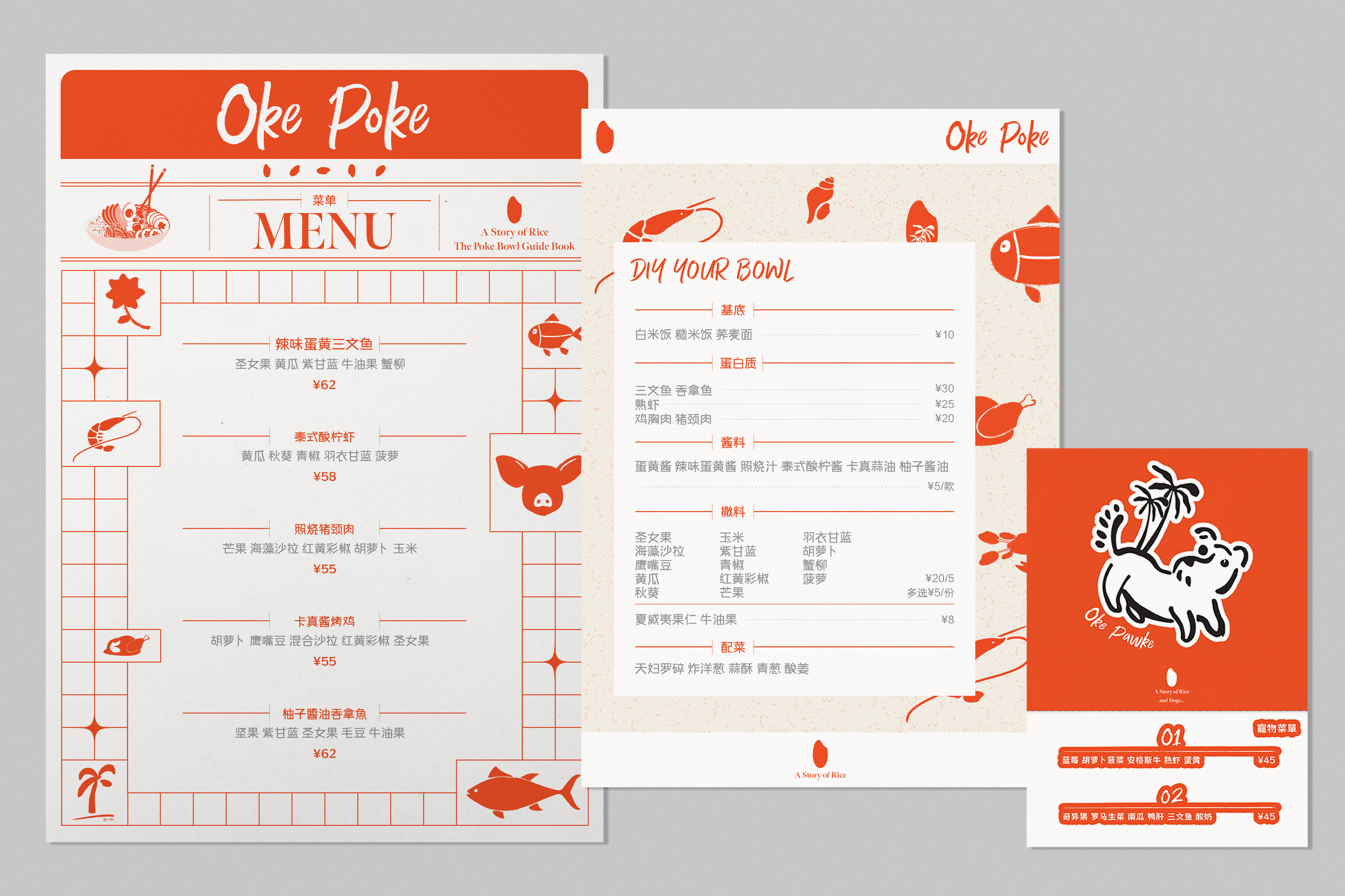
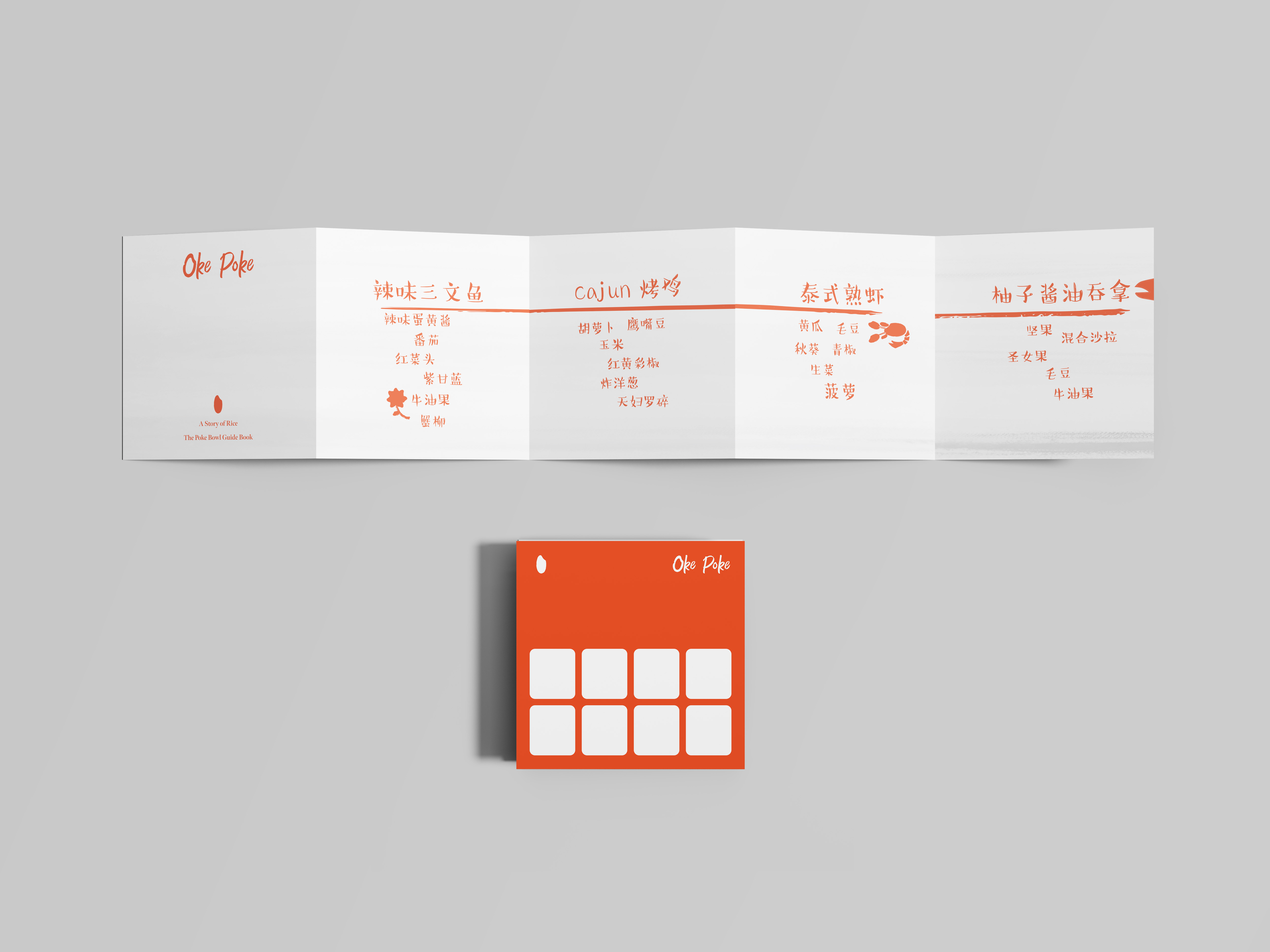
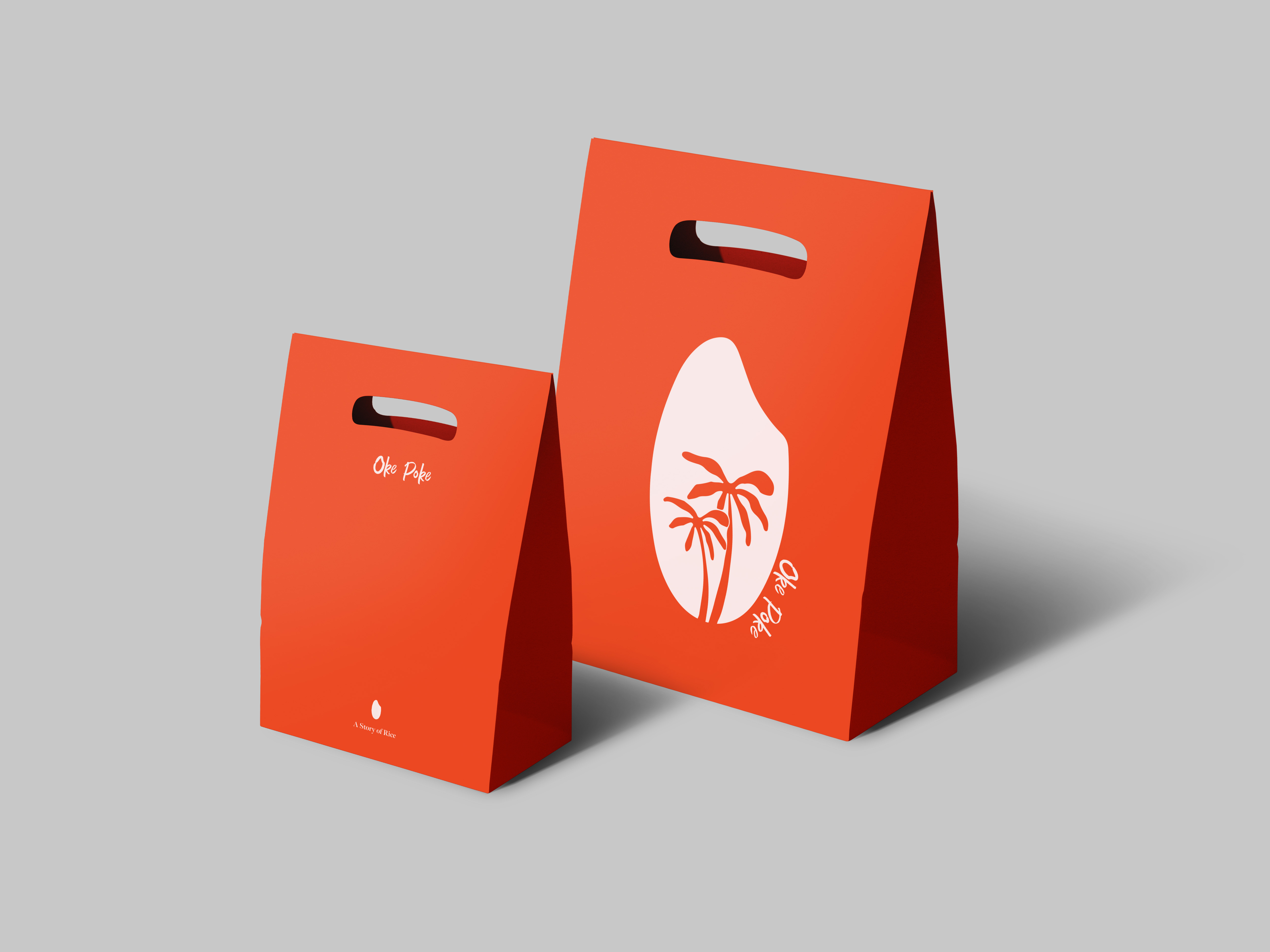
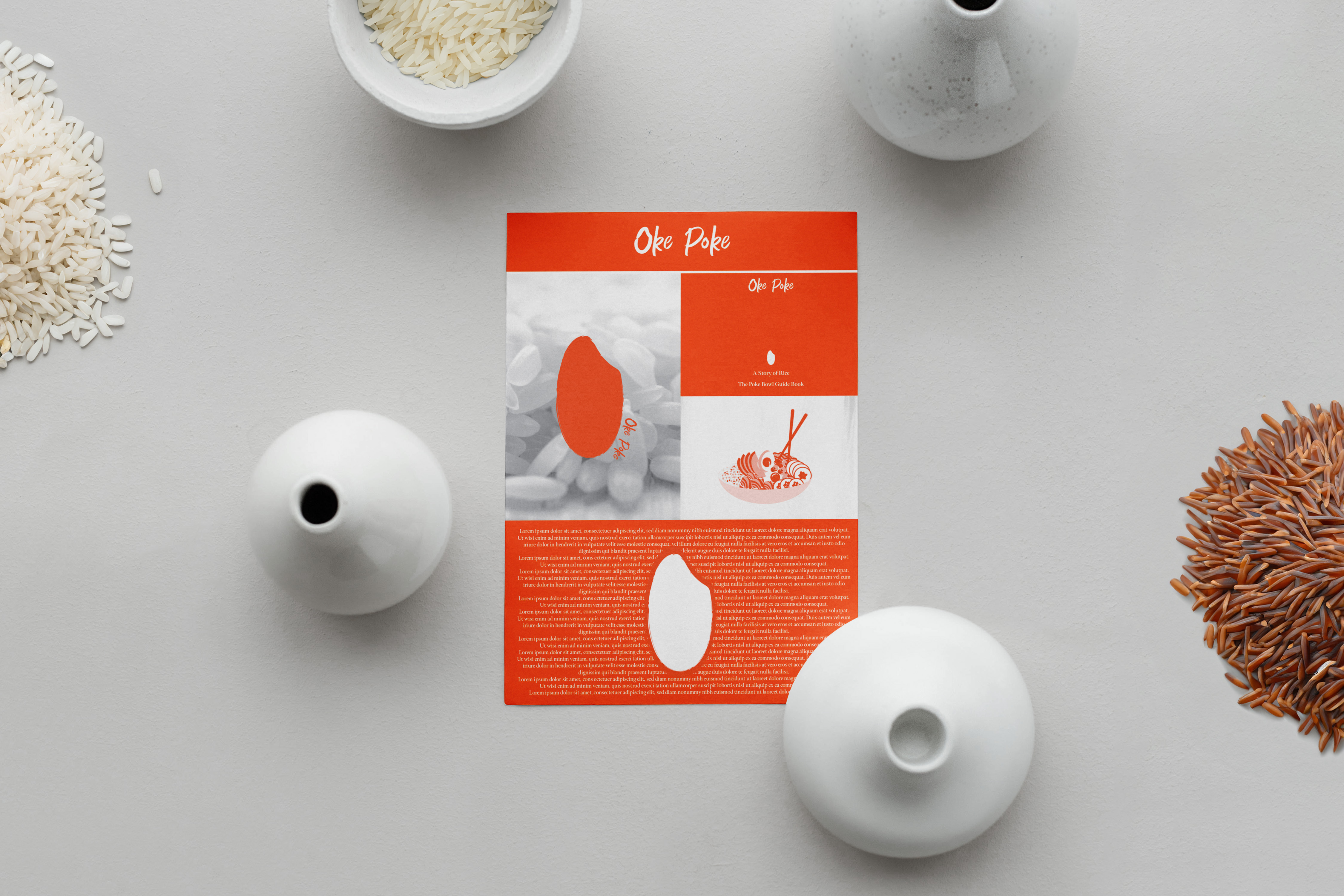
Branding project for the first poke bar in Shenzhen. We have seamlessly merged the worlds of art direction and marketing positioning to create a captivating and unforgettable experience. Our approach focuses on simplicity and visual impact, ensuring that even those unfamiliar with poke bowls will be drawn in.
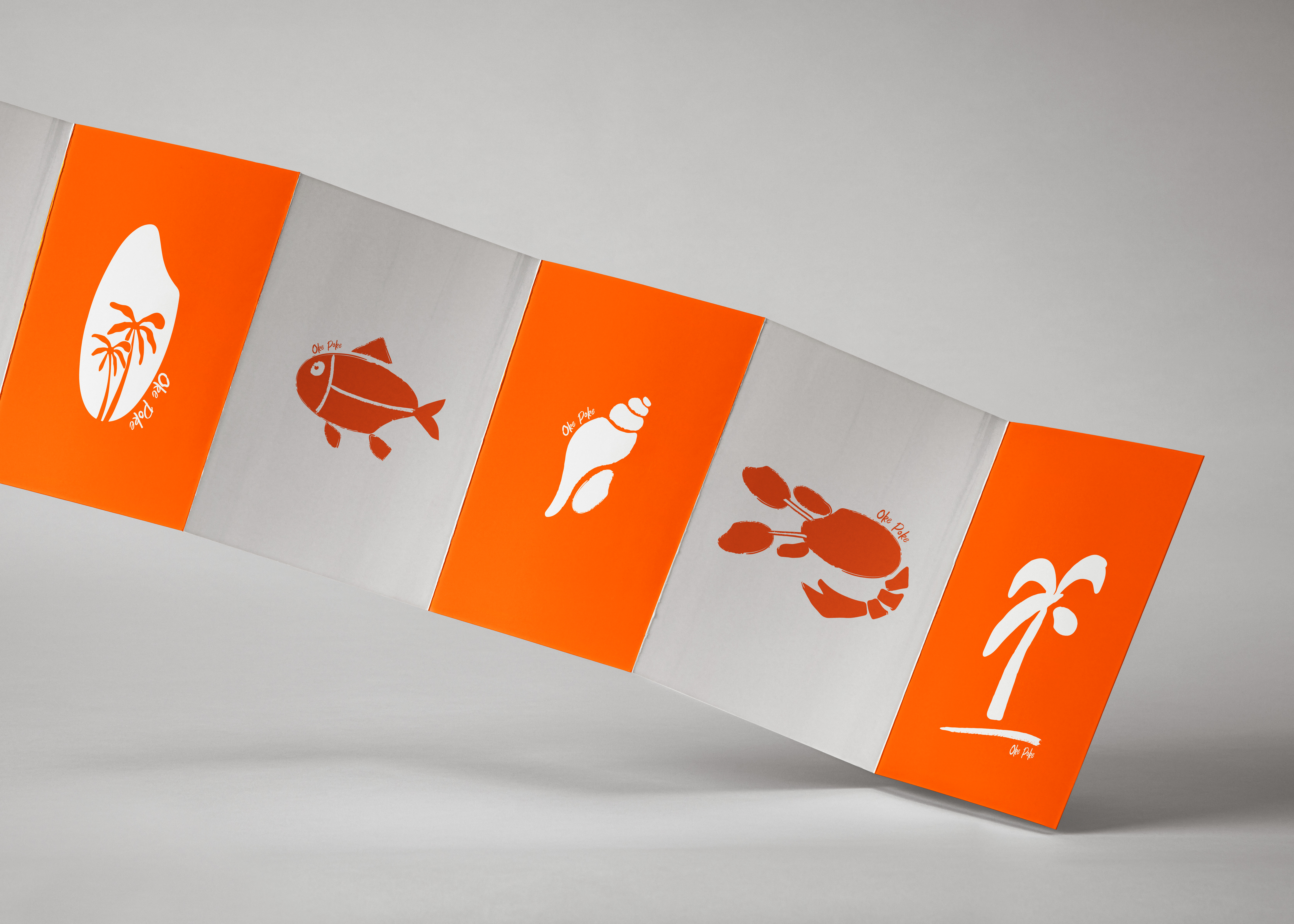
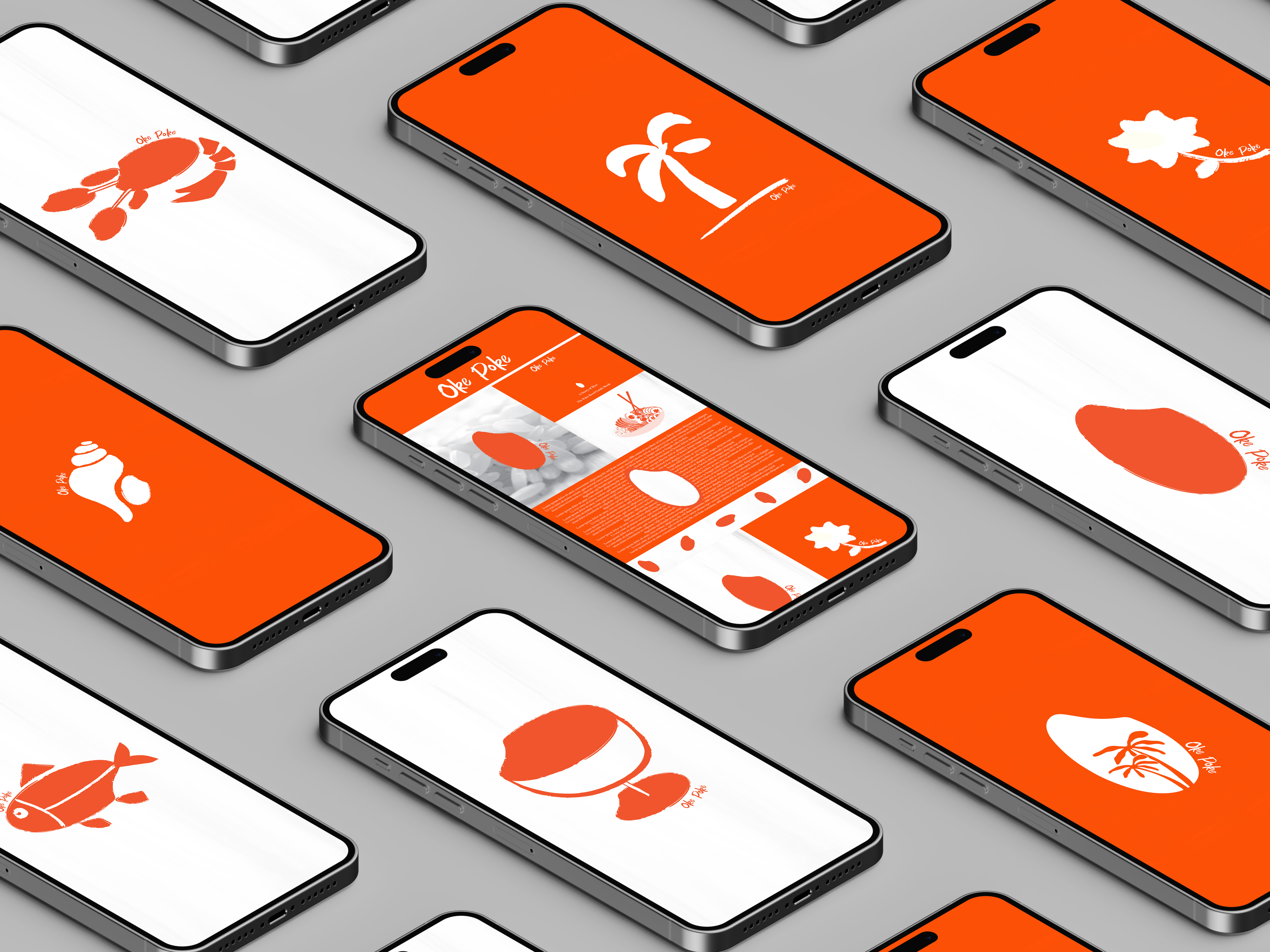
At the heart of our design is a striking logo—a sleek silhouette of rice—that instantly communicates the main ingredient of a poke bowl. The simplicity of the logo allows it to be effortlessly memorable, making it a strong and versatile asset for the brand.
Our art direction combines clean lines, bold colors, and contemporary aesthetics to create a visually stunning atmosphere that complements the poke bar's modern vibe. The overall effect is sharp, eye-catching, and irresistibly Instagram-worthy, ensuring that customers will be eager to share their experience with others.